1,000+ Entertainment Design Cases, 15+ years Amusement Industry Experience - 12 Design info@12design12.com+86 15360475354


IP Theme vs. Abstract Play: Which Is Right for Your Kids Entertainment Center?
One of the earliest decisions in a kids entertainment project can shape almost everything that follows.
Should the venue be built around an original character and story, or should it use a more abstract system of colour, form and play?
There is no universal answer.
Both approaches can produce successful spaces, but they solve different business problems. Choosing between them should depend less on personal taste and more on what you expect the venue to become.
Before selecting either direction, it helps to understand what you are actually buying.
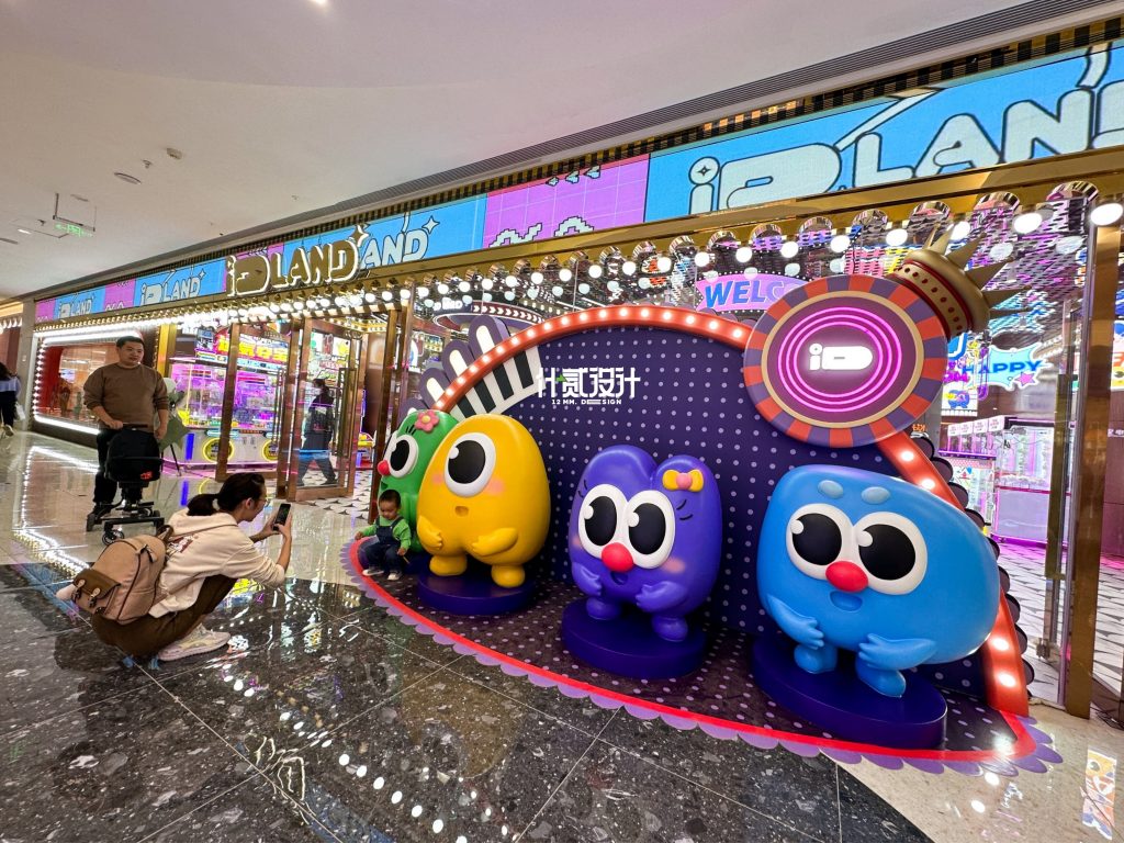
What an Original IP Theme Can Do
An original IP system goes beyond placing a cartoon character on a wall.
Done properly, it creates a repeatable visual world.
That world may include a mascot, supporting characters, graphic elements, colour rules, signage, environmental storytelling and themed applications across different zones.
The commercial advantage is recognition.
A slide can be copied. A colourful ball pit can be copied. An equipment combination can be copied.
A distinctive brand world is harder to reproduce convincingly.
For operators who expect to open multiple locations, this becomes especially useful. The exact floor plan can change from site to site, while key characters, colours and brand features remain familiar.
IP can also extend beyond interior design into birthday rooms, merchandise, social media content, seasonal campaigns and event graphics.
The trade-off is that more work is required at the beginning.
Character development, graphic design and physical translation all need coordination. An attractive illustration that cannot be turned into signage, props or spatial features has limited value to a physical venue.
That is why IP development for entertainment spaces should be designed with three-dimensional application in mind from the start.
Where Abstract Design Has an Advantage
Abstract play does not mean generic design.
A strong abstract concept can use geometry, colour, lighting, materials and recurring visual motifs to create an equally distinctive atmosphere without relying on characters.
This approach can be particularly useful when an operator wants the environment to appeal across a broader age range.
A character that works for a six-year-old may feel too childish to a twelve-year-old. Abstract visual systems have more freedom to move between children’s play, digital sports and family entertainment.
They can also be easier to refresh.
Changing graphics, lighting details or selected decorative modules can shift the appearance of the venue without redesigning an entire character system.
For projects where the business model, tenant location or audience may change over time, that flexibility has real value.
The risk is not “abstract equals boring.”
The real risk is allowing abstract design to become a collection of fashionable colours and shapes with no consistent visual logic.
If five competitors can create a very similar space simply by using the same LED strips and colour palette, the design is not providing much differentiation.
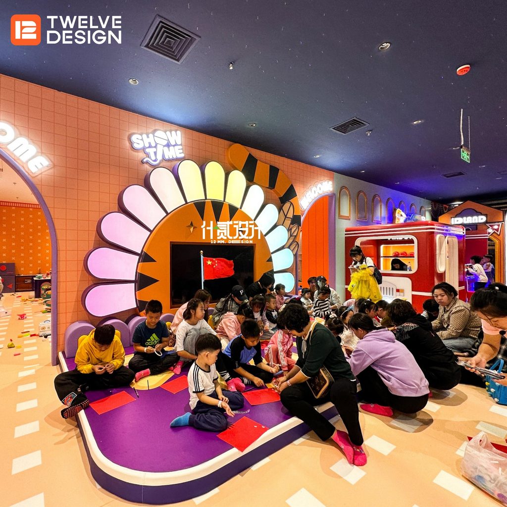
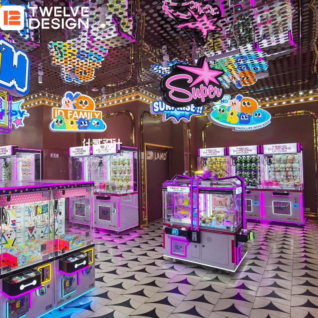
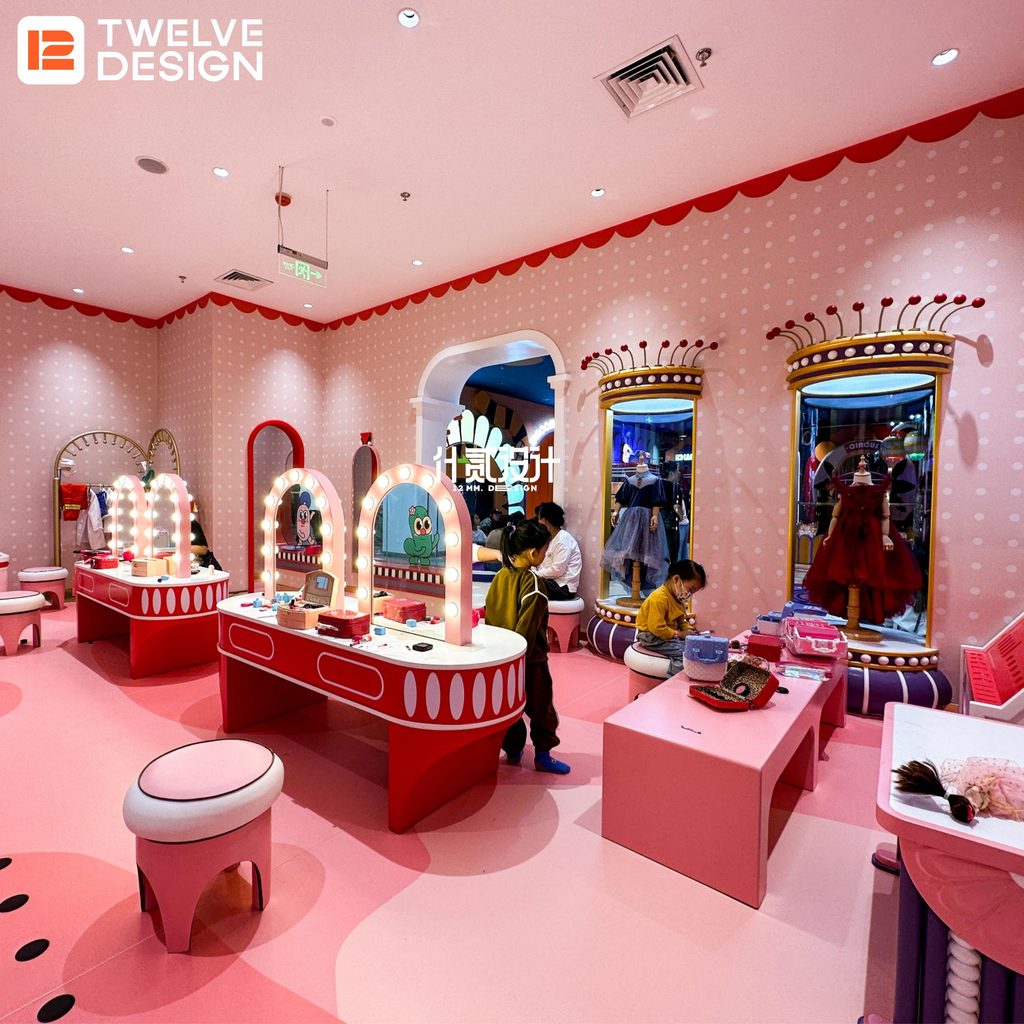
The Better Question Is: What Do You Want to Own?
When we discuss this decision with clients at 12 DESIGN, we look beyond the first set of renderings.
What should customers remember six months after opening?
Is the operator trying to establish a new brand or simply improve an existing venue?
Will there be one location or potentially ten?
How broad is the target age group?
How frequently will the interior need to change?
These questions usually tell us more than asking whether the owner personally likes mascots.
For a multi-site family brand, an original IP system may become a valuable visual asset.
For a flexible mixed-age entertainment concept, an abstract identity may make future adaptation easier.
And in some projects, the right answer is a hybrid: a strong abstract spatial language supported by one or two recognisable characters rather than a fully themed environment.
Project Example: APE PARADISE
APE PARADISE is a useful example of how an IP-led approach can influence more than graphics.
For this approximately 1,100㎡ arcade and entertainment project in Shantou, the concept was developed around an ape-character world with a cyber-fashion visual direction.
The characters did not simply appear as wall illustrations.
Their visual language informed the colour palette, environmental graphics and themed decorative elements throughout the venue.
That consistency gave the project a recognisable identity while allowing individual gaming and entertainment areas to retain their own functional requirements.
The key lesson is not that every venue needs an ape, mascot or cartoon universe.
It is that if a project chooses IP, the idea needs to extend into the space. Otherwise, it remains decoration rather than brand design.
A Decision Checklist Before Choosing
Consider these five questions:
- Are you building one venue or a brand that may expand to multiple locations?
- Is your core audience narrowly defined by age, or relatively broad?
- Do you want characters to become part of marketing and merchandise?
- How frequently will the interior need to be refreshed?
- Can your design and manufacturing partners translate the concept into physical elements consistently?
The answers often make the design direction much clearer.
Design the Business Identity Before the Decoration
IP and abstract design are not competing styles where one is always better.
They are two different ways of building recognition.
At 12 DESIGN, our role is to connect that brand decision with the physical venue. Our team works across branding, interior planning, three-dimensional design and custom manufacturing, supported by our 5,000㎡ production facility in Guangzhou.
This means character concepts, signage, counters, themed props, ceiling elements and other custom features can be considered together instead of being developed by separate suppliers with different visual standards.
If you are still deciding between an IP-led kids venue and an abstract design system, contact our team with your floor plan, audience and business model.
The right question is not simply “Which one looks better?”
It is which identity gives your particular venue more room to grow.



Amusement Future, in 12Design
